Ōtautahi Made
Services
Brand Strategy
Brand Identity
What began as Ōtautahi Crafters Market has grown into one of Christchurch’s leading destinations for locally made goods, bringing together hundreds of makers and thousands of visitors through carefully curated markets. As the business stepped up into Te Pae, Christchurch’s central convention centre, its existing identity no longer reflected the scale or quality of what it had become.
Our work began with a shift in name. Ōtautahi Made gave the brand room to grow beyond the traditional idea of a craft market, while putting its connection to place and commitment to genuinely handmade work front and centre.
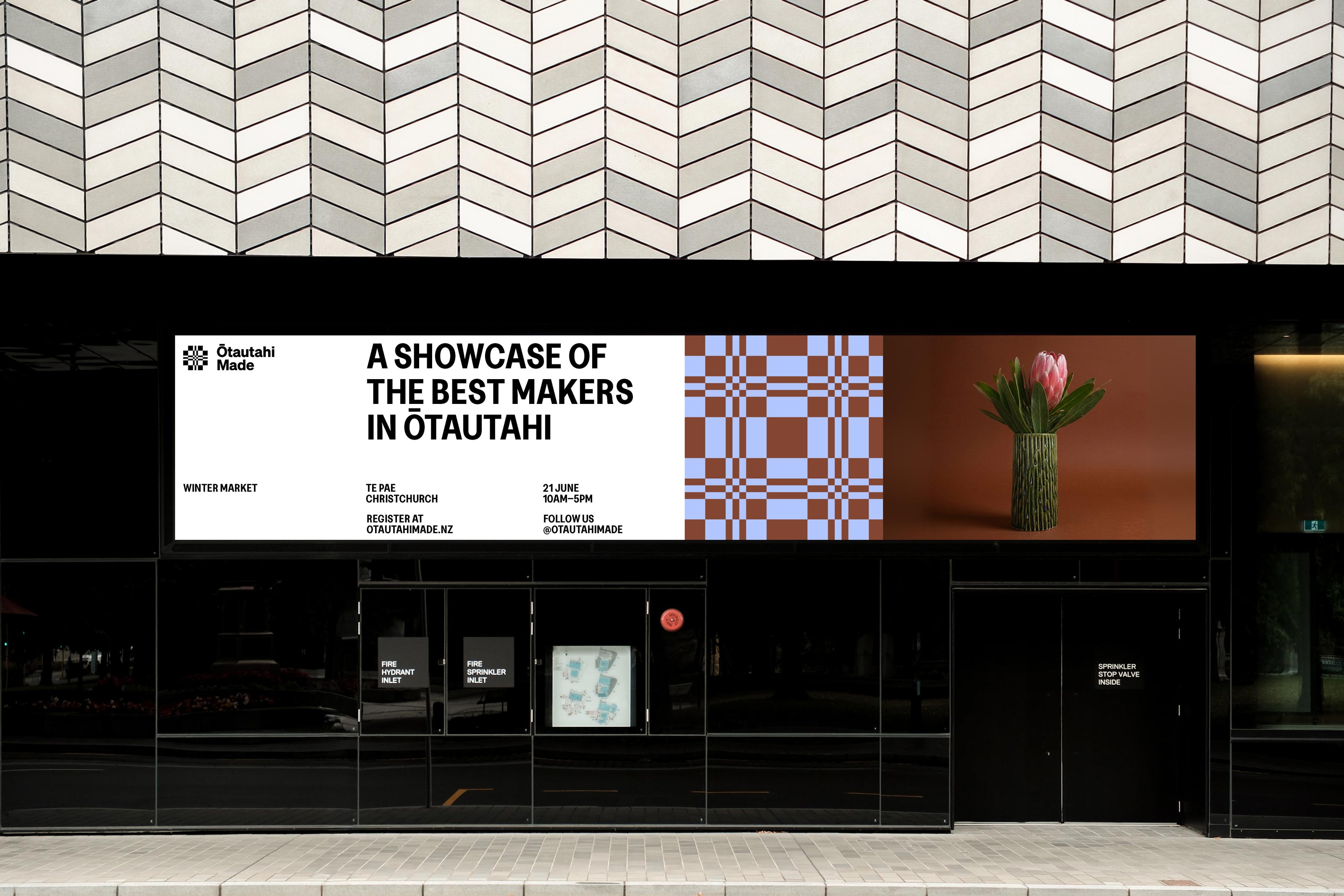
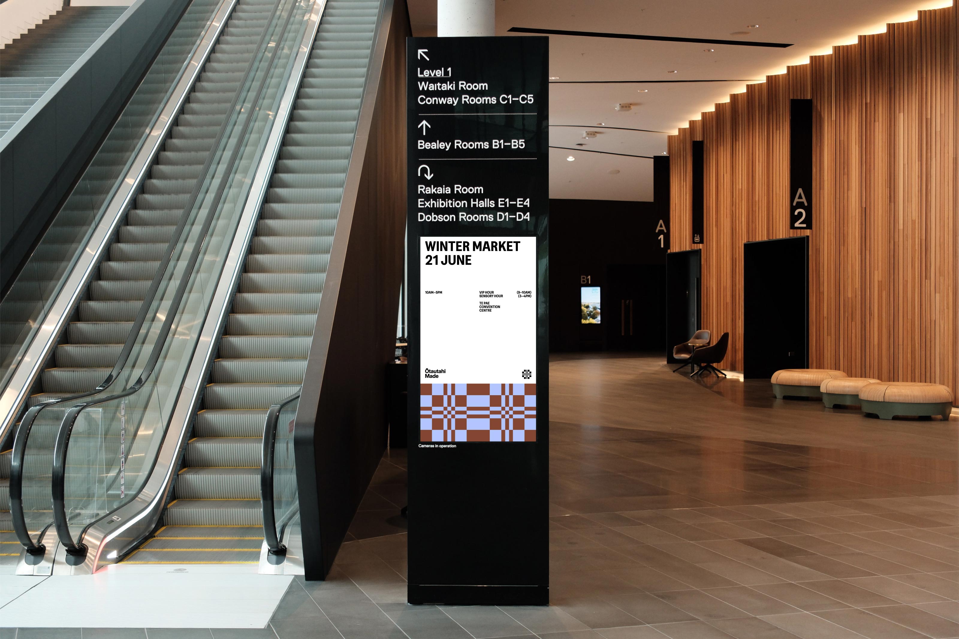
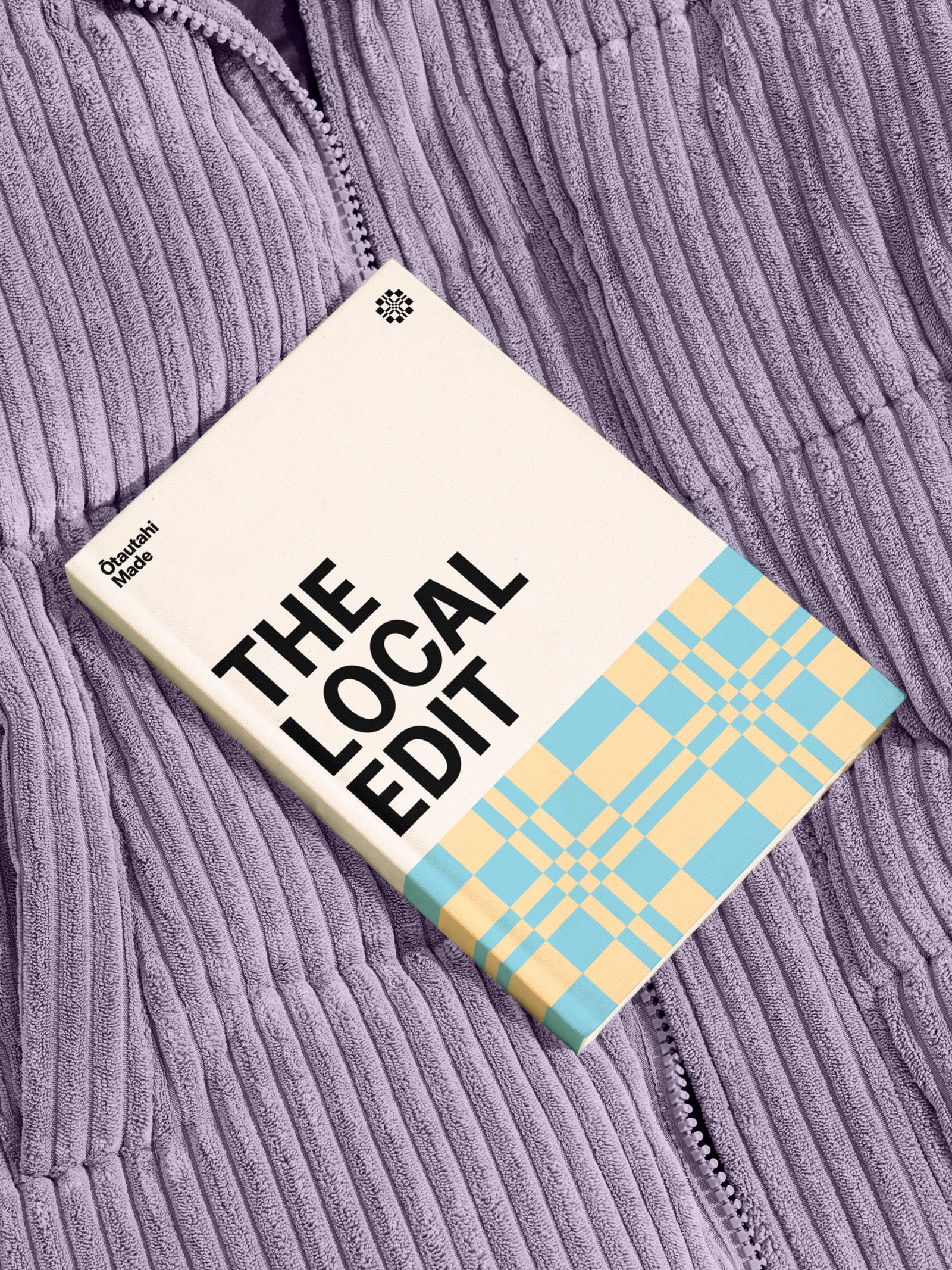
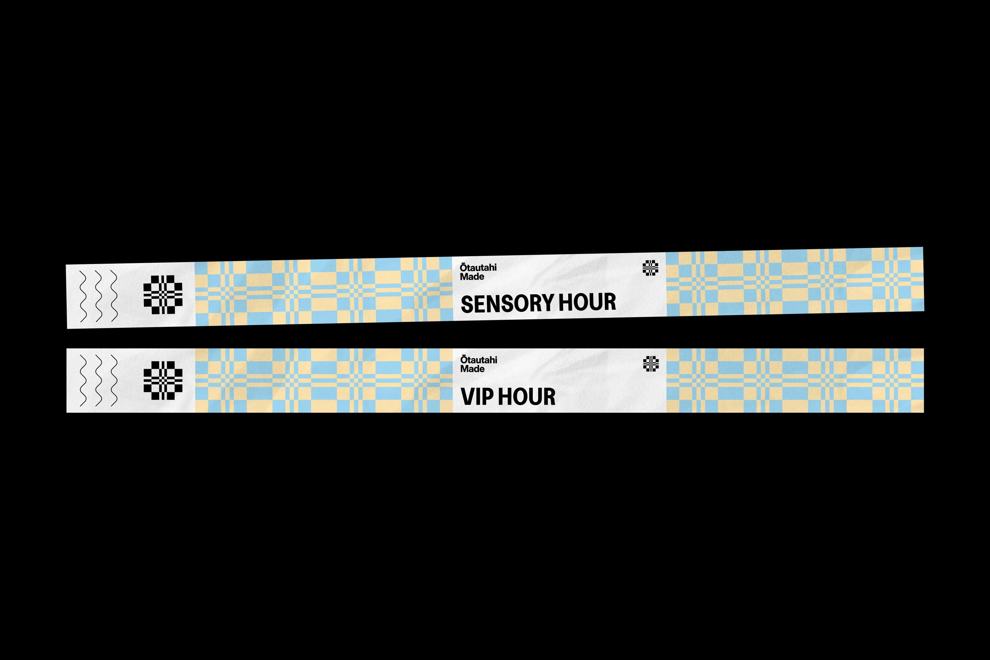
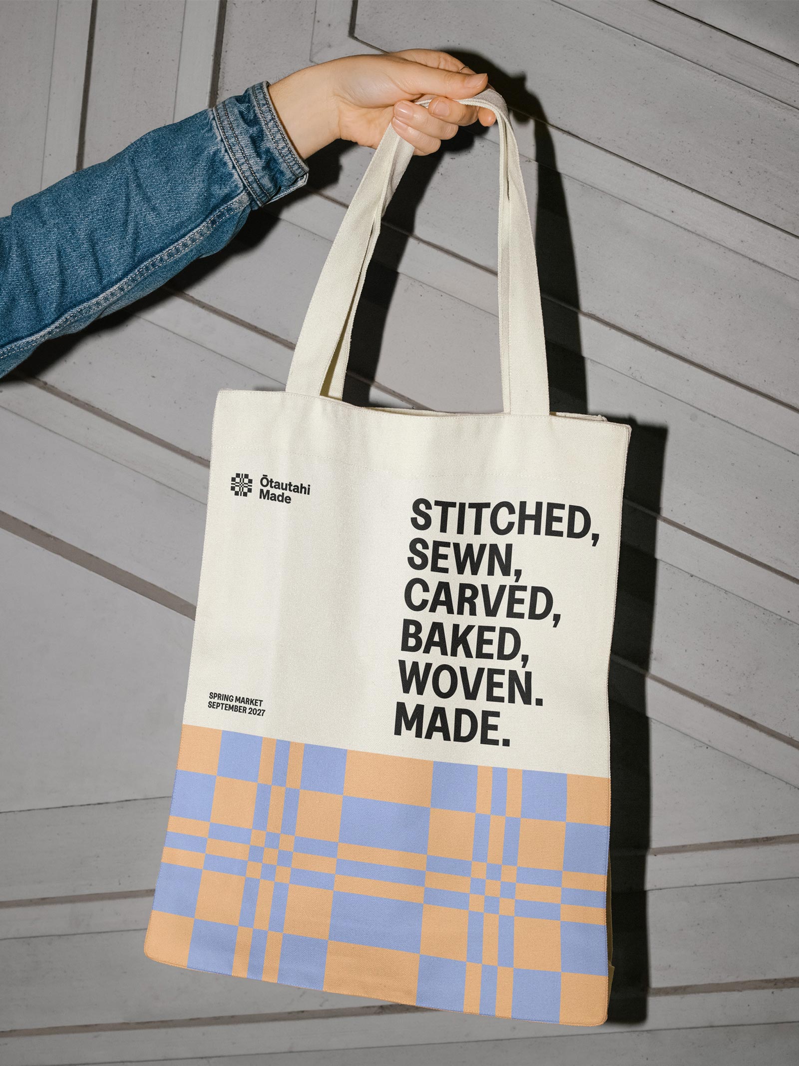
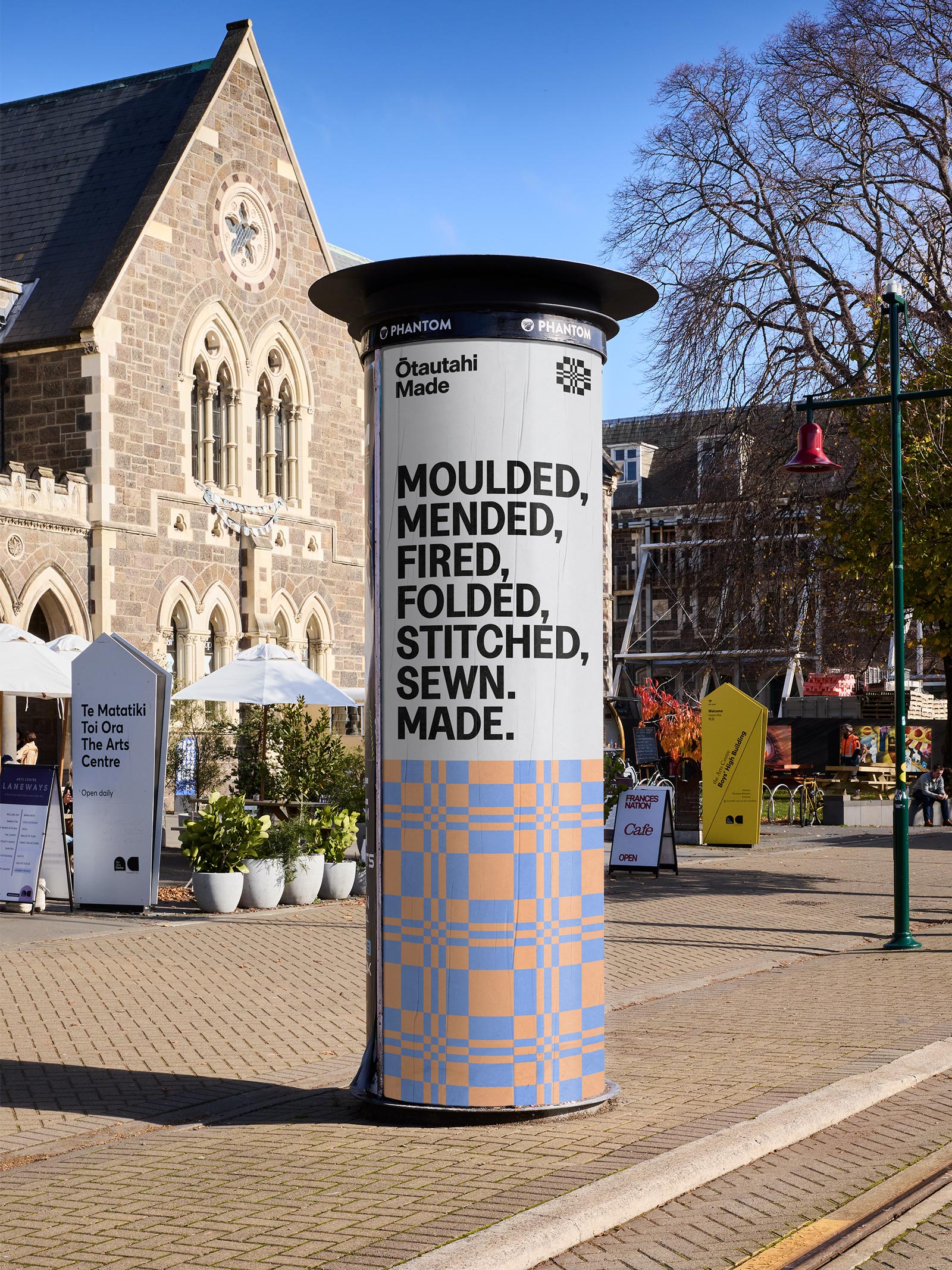
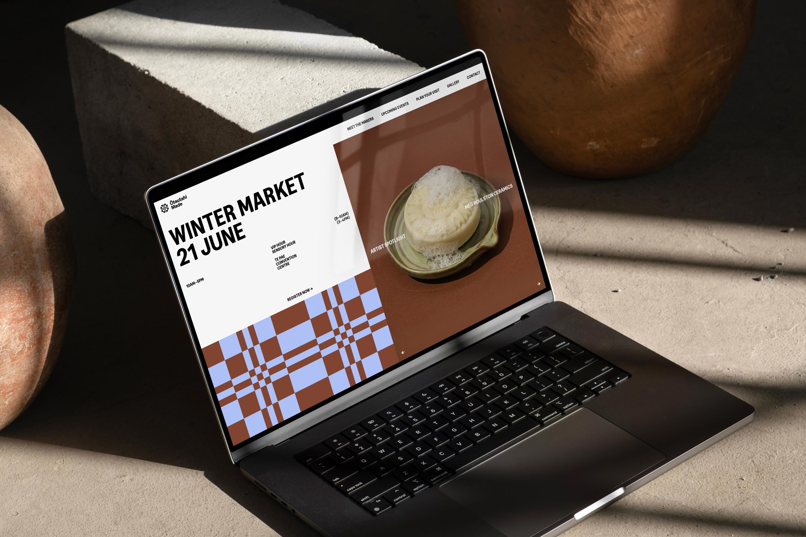
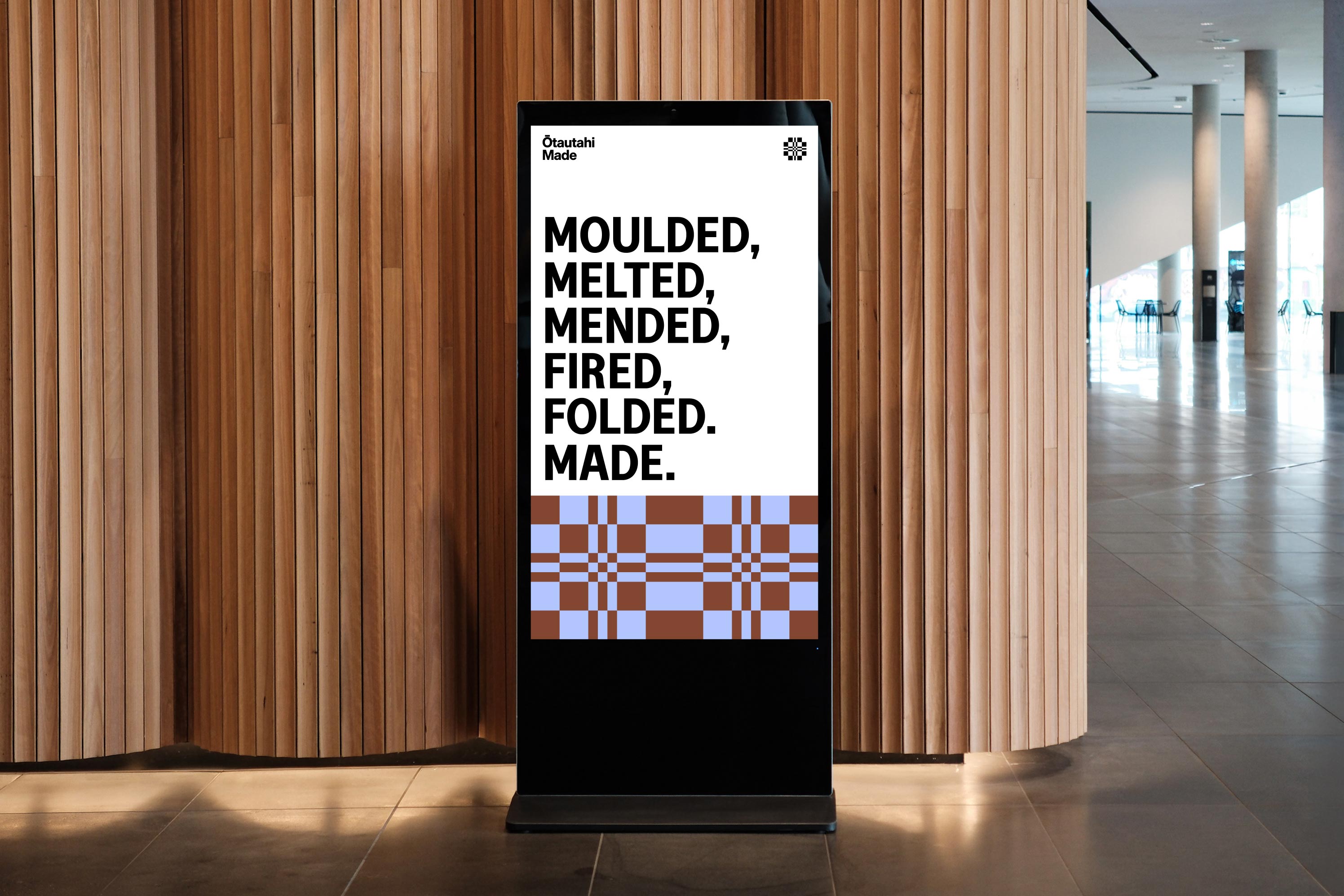
Visually, we wanted to challenge some of the softer conventions associated with craft. Instead, the identity celebrates the precision, skill and quiet rigour behind making well. A bold typographic system is paired with a distinctive icon built from the letters O and M within a structured grid, referencing both craft patterns and the physical layout of the market.
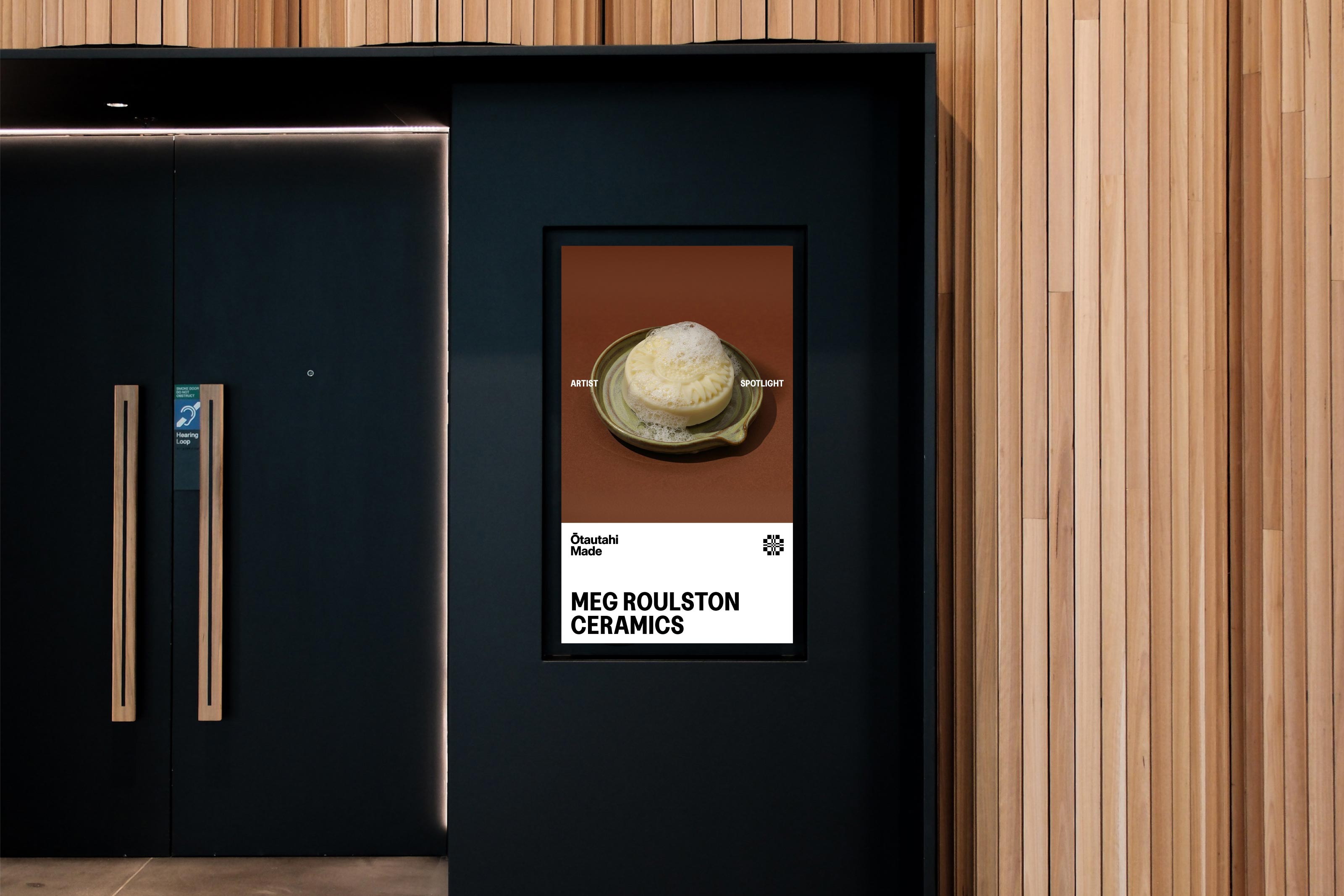
A predominantly black and white foundation gives the makers and their work space to take centre stage, while an evolving seasonal colour system allows each event to feel distinct. A more considered photographic approach also shifts the brand away from illustration, focusing instead on beautifully documented objects, makers and processes.
The result is a confident, contemporary identity designed to grow alongside the community it represents.